

When you have a dashboard hammer in your hand, everything looks like an infographic nail
This NORRAG Highlights is published by Luis Crouch[1], Senior Economist in the International Development Group of RTI International, along with his colleagues and co-writers, Alex Pavluck acting as Informatics Application Advisor and Julio Rank Wright, Senior Business Strategy Specialist. In this post, the authors warn against the overuse of data visualization without in-depth analysis: “Policy dashboards with powerful infographics could hurt more than they help”. The authors also share recommendation and examples of “best practices” regarding Data access. A version of this blog has appeared in the authors’ institution’s Medium site.
Data dashboards, loosely speaking, are instruments (be it on a website, a handheld device, or paper) that provide summary data, to inform managerial (and sometimes policy) decisions. An education example for education in England is here. In this post, we highlight the fact that while data dashboards are an attractive way to present information (for education or any other sector), there are several issues with dashboards. Some of these are discussed in this blog. One important issue that the blog emphasizes is that the ideal dashboard ought to empower users who are curious about “owning” their own analytical results, to penetrate beyond infographics, so as to be able to generate their own insights.
The popularity of dashboards for tracking policies and their impact has certainly increased over the past decade and a half as illustrated by the worldwide use of “policy dashboards” using Google Trends (Figure 1). This is an exponential (literally exponential, not “exponential” as used in popular parlance to mean “high”) growth rate of 44%, cumulative yearly. True, there appears to be a slight but significant reduction in the usage of the term in the last year or so.
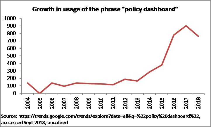
Figure 1. Google Trends over the past 14 years
At the same time, skeptics, such as Lant Pritchett of the Center for Global Development and the RISE Programme, raises the point that inappropriate or ineffective data visualizations on dashboards can cause more problems than they solve; for instance, if the dashboard does not focus on outcomes, and if the inputs it focuses on are not known, via strong empirical evidence and theory, to be linked to any outcomes. Such dashboards could end up misleading systems into spending a lot of money and effort on things that might not make a difference or could even make things worse.
The title of this blog echoes the familiar saying “When you have a hammer in your hand, everything looks like a nail.”
While policy dashboards can be useful (assuming they do not err in Pritchett’s sense), there are tools that leverage data that are just as useful but fulfill other purposes. In this blog we investigate the pros and cons of dashboards, especially in comparison to at least one other powerful online tool, namely publicly available, downloadable datasets used either for policy analysis or for more routine management.
To start, as a matter of analytical rigor, one must confront the debate Pritchett poses: is any effort at enticing users into data, even with the simplest infographics, better than nothing? Especially given where the starting point is for some countries (i.e. data available but limited resources to turn those data into actionable information or store those data in modalities that facilitate use by others)? Some countries still publish their key sectoral data in lengthy PDF formats providing masses of raw data. For example, the main way of getting data on the Ugandan education system is to look through a 174-page PDF document with just a few value-added charts on main trends. And the data are generally incomplete, as they present numbers only on enrollment, teachers, and other standard measures, but not on results or costs.
That warning aside, providing the public with dashboards that (seriously and accurately) add value to raw data is a logical first step in moving from the raw data to insights.
A dashboard such as that hosted for Neglected Tropical Diseases by the WHO is an appealing way to get a sense of the number of NTD patients in key countries via a highlight map with the ability to filter using a linked chart that shows additional data on mouse-over. Other information is attractively displayed. However, the dashboard is not so useful for deriving additional insights, beyond those meant to be seen by the designer, such as the rate of change of patients for each country. This limited view does not allow the user to drill deeper, exploring additional analytics, and poses a missed opportunity to leverage the true power of business intelligence tools. While the ability to “slice and dice” data in all conceivable ways would likely be cost prohibitive and out of scope, this short-coming would be addressed by presenting the user the ability to download these data and perform their own analysis.
Sometimes, however, lacking a simple but powerful causal theory, dashboards that simply alert to outcomes are ideal. An example is the work performed by RTI for USAID under the Early Grade Reading Barometer, which essentially shows results and some comparisons, but does not specifically look at inputs or suggest explicit or implicit fixes (nor does it allow downloads or drill-downs that go beyond the insights intended by the designer, avoiding the trap Pritchett warns about.
In contrast to both, the powerful and attractively-designed USAID “Idea Country Dashboard” allows one to have a great deal of information by country but also allows one to download data in order to formulate queries that the dashboard designers would not have anticipated. Most of the relevant data for any country, for all the key sectors, ranging from the economic to the political to the social, are displayed in each country’s page. A huge amount of information is displayed in a non-busy way, via the use of clever infographics. And, one can drill down into sub-sector information. In theory, if one wanted to go beyond what the dashboard shows, the system allows one to download the data. That way one can formulate queries that are hard to formulate within the dashboard and that the coders would not have explicitly anticipated in contrast to sectoral experts which may already be working on specific queries. For instance, to target programs, one could formulate unanticipated queries such as “In which countries where GDP per capita is above the world average is infant mortality also above the world average, and where (presumably) therefore organization and prioritization, rather than raw resources, may the issue?” But, perhaps because the main effort was put into the “Dashboard” effect, such queries are not easy.
An example of an interface that relatively minimizes the dashboard aspect and maximizes the query and analytical aspect is the World Bank’s Development Indicators. The education-specific section of this facility is EdStats, where users can unload an enormous range of education data in an easy, if not completely non-trivial interface. Data selection takes a few minutes and download is instant. Analysis takes a few more, depending on the analyst’s experience.[2] While EdStats makes possible powerful visualizations of education data, most of the effort seems to have gone into making data, as such, available, as the visualizations are not as neatly presented as in sites that seem to specialize in visualizations, such as the USAID Idea Country Dashboard discussed above.
Finally, infographics, stylized presentations of data that lack user interaction, can be married with managerially-relevant information. The USAID-funded ENVISION project, implemented by RTI with other partners, has published infographics that use quantitative indicators to suggest managerial action (with, one hopes, a good causal theory based either on experimentation or rich and documented experience, to avoid the Pritchett trap). An example is a tool for guiding the program implementation lifecycle on trachoma, found here.
We can end with a few summary suggestions:
- Policy dashboards with powerful infographics could hurt more than they help, if the analysis either “behind” or “induced” by the infographics is wrong (or is easy to misinterpret) and misdirects policy attention. Of course, this is nothing new: the expression “garbage-in, garbage-out” is at least 70 years old. In that case, simple infographics of important outcomes are probably best, as in the examples above.
- It is helpful if analysts can get access to the “raw” data behind the dashboards and derive their own conclusions as in the example we gave. This can feed debate, contestation, and peer review as to the interpretation of the data—it could also feed erroneous conclusions, but that is a risk one has to take: the world has not progressed by having unified Ministries of Truth tell us everything we need to know. The World Bank does an excellent job facilitating this, as does the UNESCO Institute for Statistics. The latter also offers powerful infographics, including downloadable maps such as the one below.
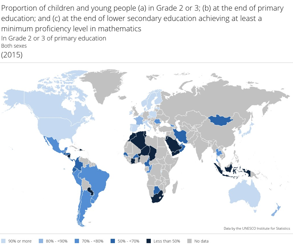
Figure 2. UNESCO Institute for Statistics (UIS) Downloadable Map
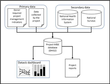
Figure 3. Context diagram for project M&E data aggregation
- Related to the above, we should work just as hard on the underlying, core data systems and data flow pipelines that can support the analytic tools. The context (Figure 2) represents a data warehouse model where primary and secondary data aggregated to allow for data visualizations and program reports that utilize data from multiple sources.
RTI’s Global Health division emphasizes both the data “engines” and the visualization tools. The “engine” behind the visualizations is the open source data warehouse platform, District Health Information System v2 (DHIS2), developed by the University of Oslo. The visualizations are a combination of DHIS2’s build in dashboard and reporting capabilities and business intelligence tools such as Tableau and Microsoft Power BI.
- Increased interest in the use of data and technology for improved development outcomes from donors, new private sector philanthropies, and practitioners often leads to being caught up in the hype and ignoring the difficult questions. In assessing Data Revolution interventions, one must always ask “what is this amounting to?” but more importantly as practitioners we need to constantly remind the world that “there is no App for development.”
- As has been noted elsewhere by one of us, if the dashboard is meant to be a social accountability tool, it is most helpful if the dashboard is just one, simple, additional tool in a system where accountability is already practiced. If a development experiment needs to introduce the dashboard, the notion of accountability, metrics of accountability, new methods of getting those metrics into a web-based dashboard, and ways for citizens to engage with the data through the dashboard and hand-held devices, the effort will typically fail out of its own complexity; not because of the dashboard effort, but the dashboard part of the effort will get a bad name. In other words, it may be unwise, in the Data Revolution, to be too Simple might be more revolutionary than complex.
Photo credit: SFIO CRACHO/Shutterstock.com
Contribute: The NORRAG Blog provides a platform for debate and ideas exchange for education stakeholders. Therefore if you would like to contribute to the discussion by writing your own blog post please visit our dedicated contribute page for detailed instructions on how to submit.
Disclaimer: NORRAG’s blog offers a space for dialogue about issues, research and opinion on education and development. The views and factual claims made in NORRAG posts are the responsibility of their authors and are not necessarily representative of NORRAG’s opinion, policy or activities.
[1] Corresponding author: lcrouch@rti.org.
[2] Incidentally, for the curious, they are: Azerbaijan, Botswana, Dominica, Dominican Republic, Equatorial Guinea, Gabon, Nauru, South Africa, Suriname, Trinidad and Tobago, and Turkmenistan, taking averages of five years for both variables. The obverse, namely countries that have below average mortality while having below average income, are just as easy to find once the download is made.
I couldn’t agree more, in my experience, data visualization is, at best helpless to establish research-relevant correlations, but in some cases a way to escape accountability and critical analysis: tell me how you visualize your data and I’ll tell you who you are… It would be interesting to analyse how different institutions/donors present data related to their programmes and policies and what it says about the way they want to present their work and how it eludes certain questions.
Glad you found it interesting!